JDD Photography
I'm just your average Millennial, obsessed with staying home, binge-watching Parks & Rec and drinking all the Diet Coke in the house. I am a lover of Israel Diaz, female led businesses and long flowy dresses.
Welcome to my home on the internet where we talk life, theology, womanhood, marriage and work.
Search It
Archives
- October 2025 (1)
- June 2024 (1)
- May 2024 (1)
- April 2024 (1)
- December 2023 (5)
- November 2023 (2)
- October 2023 (3)
- September 2023 (5)
- August 2023 (3)
- July 2023 (3)
- May 2023 (2)
- April 2023 (1)
- August 2022 (3)
- December 2021 (3)
- October 2021 (3)
- September 2021 (4)
- August 2021 (2)
- February 2021 (1)
- January 2021 (9)
- June 2020 (1)
Categories
Take Better Smart Phone Photos Of Your Kids: Part II
September 21, 2023

When it comes to smartphone photos, don’t sell yourself short.
You have a powerful device in your pocket that is capable of getting you frame-worthy images, you just have to know how to use it. If you missed last week’s post all about lighting, make sure you go back and read that one. Light is the foundation of photography so you’re going to want to start there first. However, if you’re all caught up on that post, then you’re ready to talk about composition.
“Composition” is really just a fancy way of talking about where things are within your frame. Often, when we go to snap a photo on our smartphones, we usually put the person right smack in the middle of our frame. This is very intuitive of us and makes for a pretty standard portrait. But what I want to talk to you about today is how to turn a standard portrait into an interesting one, into a portrait that gives you feelings.
So, let’s talk composition…
1. The Rule of “Thirds”
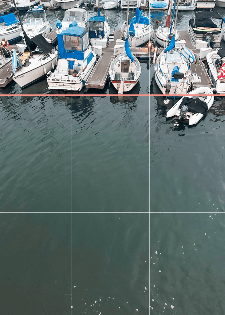
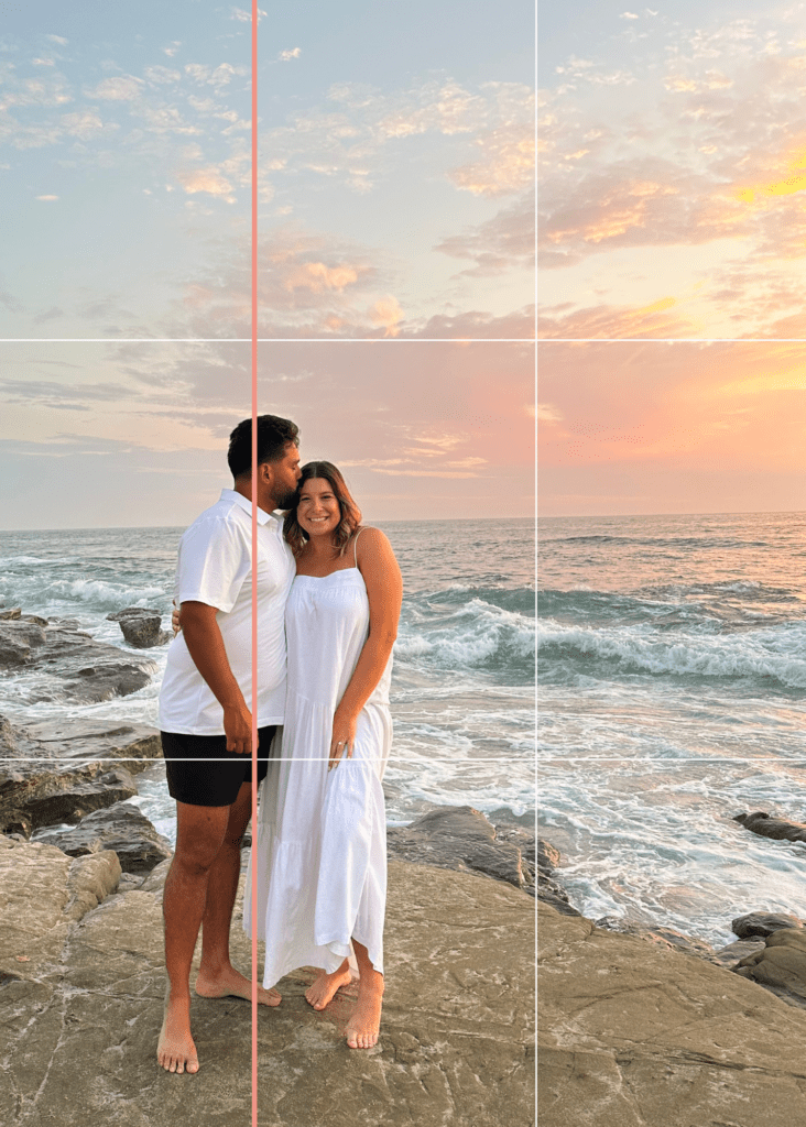
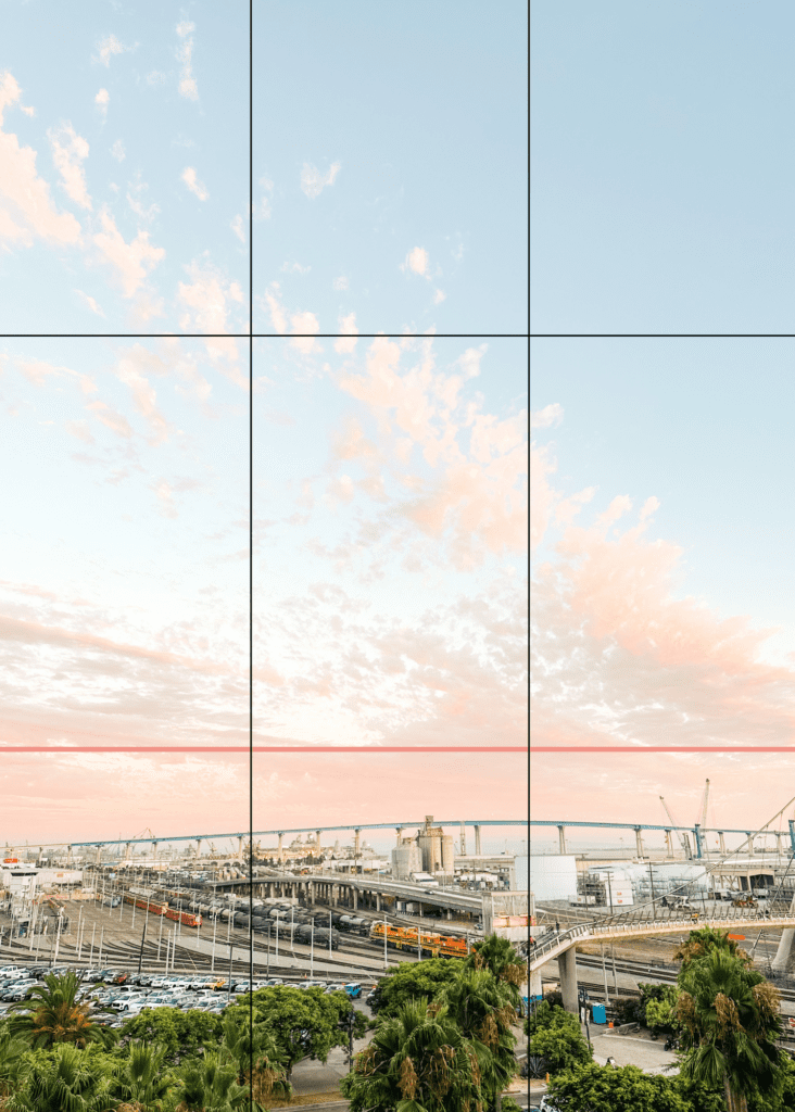
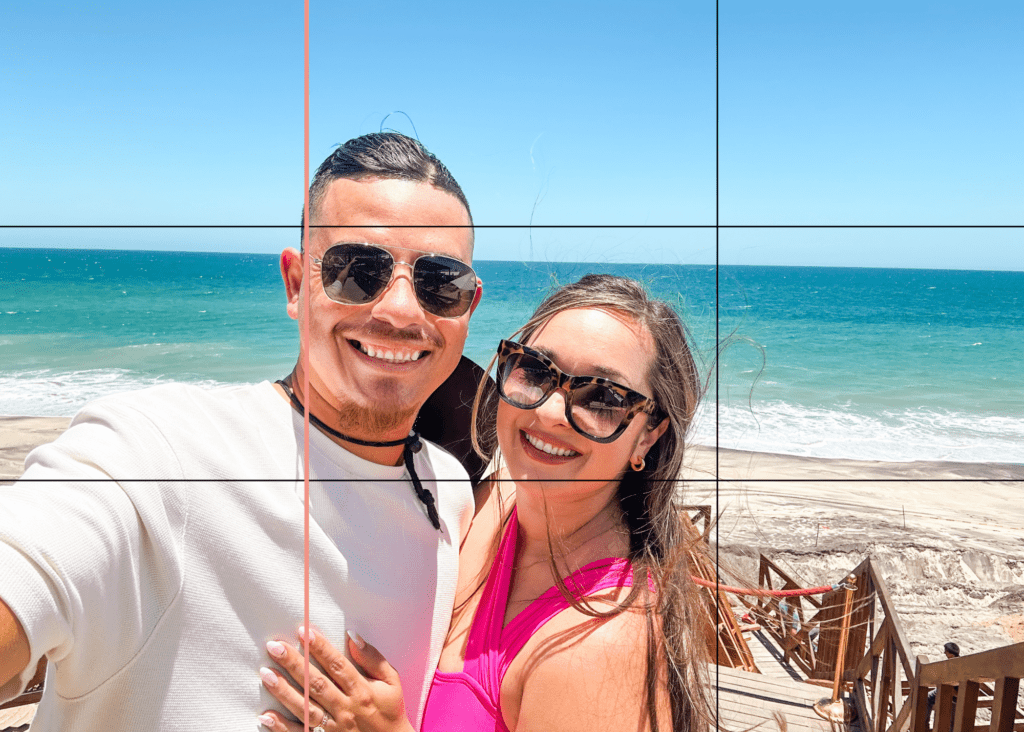
If you’ve ever known a photographer, you may have heard of “The Rule of Thirds”. This “rule” that isn’t actually a rule, just a helpful guideline, is the idea that you will get a more visually appealing photo if you put your subject (or, the thing you’re focusing on) in one of the thirds of the frame. Many cameras have a grid where you can see the frame divided into 9 squares (3 vertical lines, 3 horizontal lines). If there is no grid, try to use your imagination and put your subject where you’d guess one of the lines are. In order to abide by the rule of thirds, you would put your subject on or inside one of those grid lines like this:
2. “More Sky” or, as it’s more commonly known as, “Negative Space”
The rule of thirds and negative space sort of work in tandem. If you put your subject on one of the third gridlines, you are likely going to have more negative space. The trick with negative space is to include more blank spaces in your photos. Spaces that aren’t distracting, that don’t have a lot going on. In nature, you can find negative space in large, expansive spaces like the sky or a body of water. But in everyday places, negative space can be found in a wall, a table, or sometimes even next to a plant that’s all the same color. Let me show you a few examples:
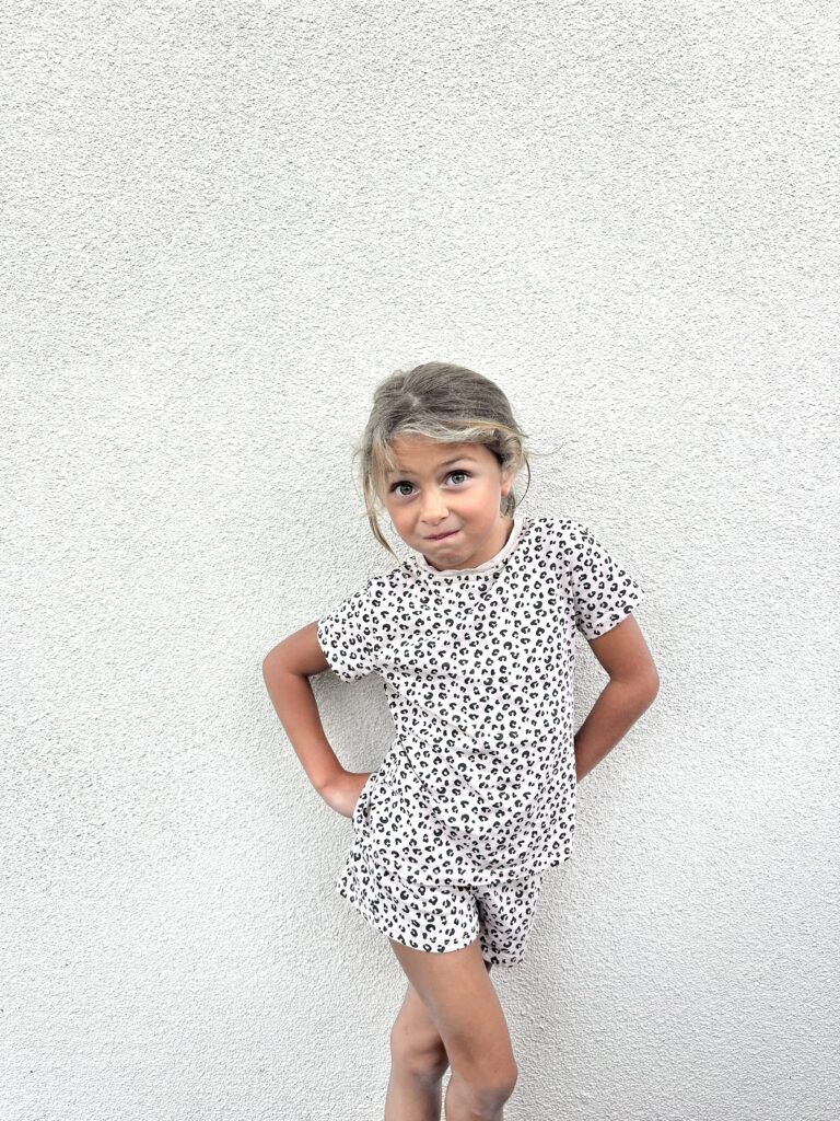

In this photo, my niece is in front of a boring white wall. But because there is nothing to look at behind her, she really pops. Not only that, but this photo feels expansive, it feels spacious, it feels calm. It feels like I have room to move around, unhurried, and I can linger over this photo and all the details of this little cutie because my eyes don’t hurt when I look at it. There’s not much to look at or focus on except for her. The same goes for this photo of my nephew, even though he’s on a white sheet and not standing, the white sheet acts as negative space, giving us that expansive feeling again.

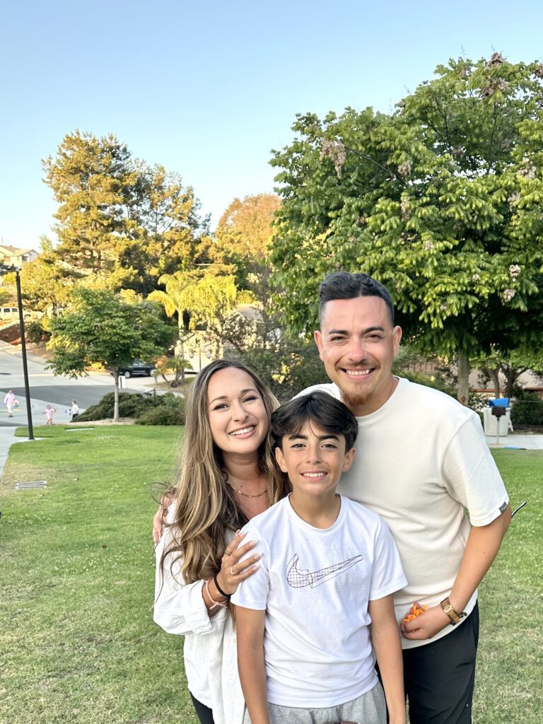
Now, this is a typical photo taken by an everyday iPhone user. It’s fine, the light is good, and we look happy (avert your eyes from the cheetos in my husbands hand lolol). But it feels cramped instead of feeling spacious. There’s a lot of ground in this photo and it feels chaotic in the sense that there’s grass in the foreground, middle ground, and background. Where are you supposed to focus? We need more negative space. We need more sky. The second image is the same one just cropped in a way that abides by the rule of thirds and gives us more negative space. Look how much more sky there is in the frame and ask yourself what that does for you when you view the images?
Negative space helps with the overall feeling you get when you look at an image. So when you’re taking a photo, try to remember to add in “more sky” to remember to tilt your smartphone up so you get more negative space.
3. Symmetry and Leading Lines
Sometimes the most aesthetically pleasing images are the ones that are most symmetrical, the ones where half of the frame is essentially mirrored to the other half like the examples below:


However, to add even more interest, you can lead the viewer’s eye through “leading lines.” Sometimes these lines lead directly to your subject, and sometimes they don’t. The point with leading lines is to help your viewer see what you want them to see without losing balance in your final image. Here are some examples:


Do you see how in the first photo, the railing is leading you directly to my subject? And how in the second photo, the objects form a line for your eye to follow?
4. Layering
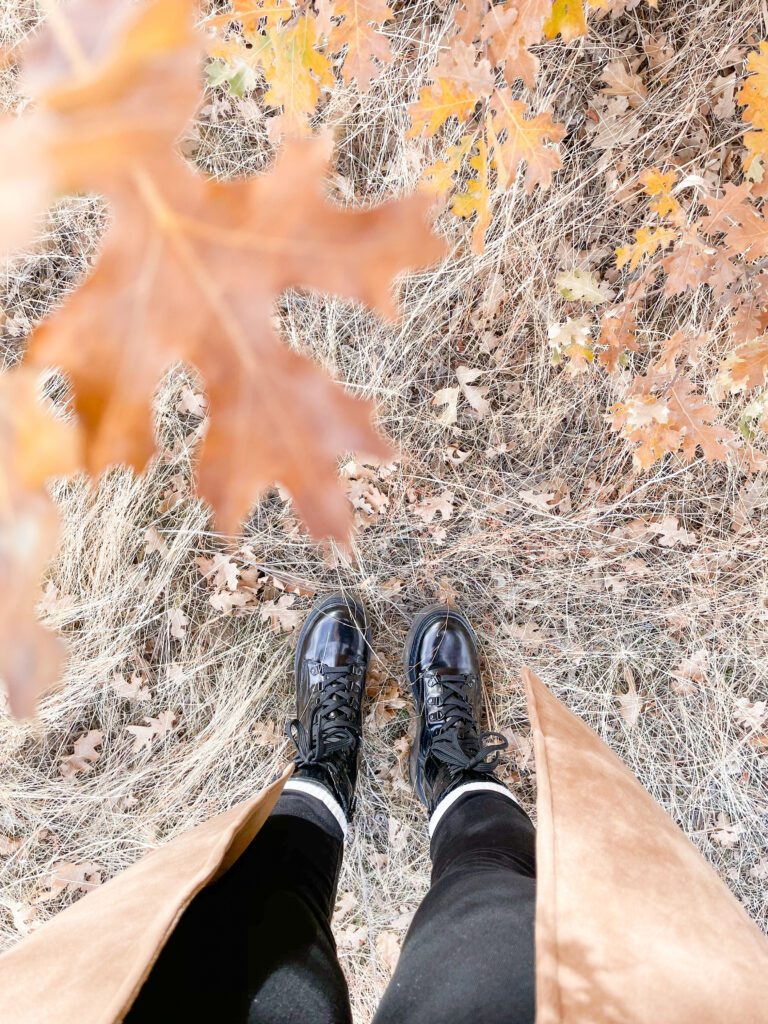
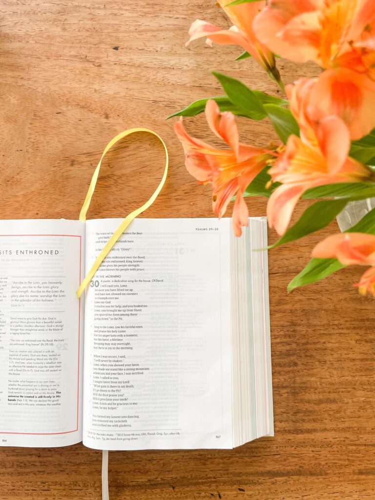
One of my all-time favorite ways to add visual interest to an image is to “layer” it. Layering is simply adding something to the foreground so that your image has depth. I like to use plants, or sometimes a wall, but getting some sort of object really close to your lens so that you can see it but it isn’t in focus adds such an interesting element to your final image. Here are some examples!
5. Get In Close
Lastly, I really love a good filled-frame shot. Something that feels close, cozy, and full. This is sort of the opposite of negative space, but if you do it with intention, the filled-frame feels intimate and not chaotic.
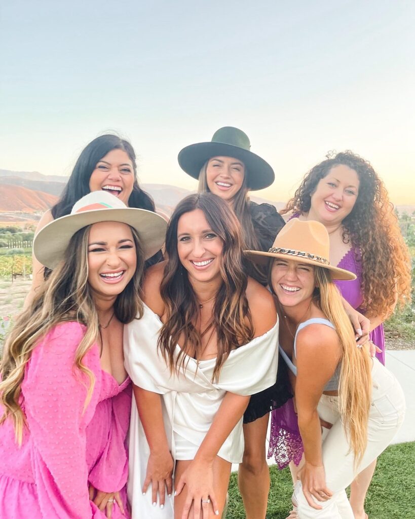


Congrats! You’re On Your Way To Being a Composition Master!
If you made it all the way to the end of this post then congratulations! You are well on your way to taking some incredible photos of your loved ones all with the tiny device that lives in your bag! This is going to make family events, outings, and everyday life so much more fun knowing that you have the ability to get some really great images that your family can treasure. Now, I want to hear from you! Tell me all your thoughts, your struggles, I want to hear them all. Was this blog post helpful? Do you need more clarification, examples? Let me know in the comments! Until next time, friends!
xo,
Jess
Meet Jess!
The Jesus followin', Free People wearin', chocolate chip cookie eatin' Diet Coke addict who loves her man, good fiction, and all things sparkly
Let's be friends!